- The Google Photos app now has a new design. It is simpler and brings your content and the search feature to the forefront.
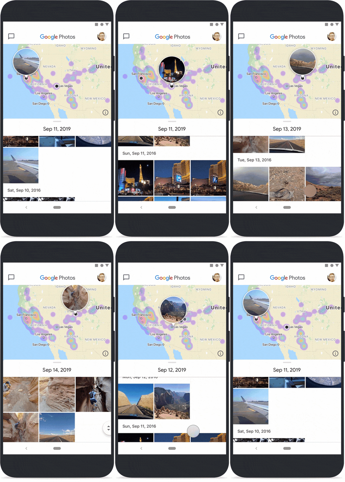
- There are also a few new features onboard, with the long-awaited map view being the biggest.
- Google also ever-so-slightly changed the app’s logo.
Today, Google announced a new redesign for its unbelievably popular Google Photos app. Along with a fresh new look, the company is also rolling out a few new features and a slightly altered logo.
These new changes are pretty exciting, but don’t worry: they aren’t going to drastically change your experience using Photos. Instead, the changes are meant to make the app even more intuitive and easy to use, with your content being front-and-center.
Google Photos redesign: A new look and new features
Overall, Google has made Photos much simpler. Your photos and videos will be bigger on the page which means far less empty space. The search function is also more prominent. Check out the GIF below to see it in action:

You’ll likely notice that the Memories bar is more prominent and there’s a map view in there. That’s because Google Photos will now put more emphasis on showing you your old photos and videos since, according to Google, it is one of the most beloved features of its users. There will be more memories and different kinds, including media of you and your best friends, trips, etc.
Related: A beginner’s guide to Google Photos
Most importantly, though, you can now hide specific time periods of individuals from your Memories. That means you no longer need to worry about the app surprising you with photos of your ex-girlfriend or videos of relatives who have since passed away.
Finally, there’s a long-awaited new map view for Photos. This allows you to see the photos you’ve taken on a map so you can easily find that video you shot at the Grand Canyon without needing to remember when you took it. Check it out in action below:

As usual, this new design and the new features will roll out to users over the next week or so. Sit tight, it might be a while before they arrive on your device.
Oh yeah, a ‘new’ logo too
Google also slightly refreshed the Google Photos logo. The squared-off edges are gone as are the shadowed areas. Check out the transformation below:

Thankfully, this new logo isn’t so similar anymore to the logo for the messaging app Slack. We’re not sure if that’s why Google made the change, but we look forward to not accidentally opening Slack when we meant to open Photos (or vice versa).
For more info on Google Photos and tips on how to use it, check out our other articles below!
More posts about Google Photos


